New Jersey
Artly: An art history app for all.
Artly: An art history app for all.
PROJECT: Artly | ROLE: UX Designer | DURATION: June 2022 - August 2022 (2.5 Months)
“Life imitates art far more than art imitates Life.”
- Oscar Wilde
Whether it is figuring out how to decorate a college dorm or taking inspiration for personal endeavors, we can learn from a lot from art’s past and present. With such rich, expansive history, we can begin to explore the future, ranging from architecture, product design, or even art as an entity.
Problem and Solution
With art from all around the globe from centuries upon centuries, it is difficult to find exactly what you want to learn. More than this, how can someone look for something they did not even know existed? For those who want to explore art, it may be incredibly daunting to start. I created an exploratory user flow to address these concerns, featuring personal artist curations, an expansive database, and effective organization features.
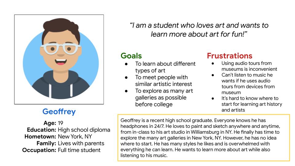
Understanding the User
I conducted interviews with five (5) users. I initially asked about their thoughts on physical art galleries and potential frustrations. To my surprise, the reason users attend art galleries were quite different, as well as their frustrations. I constructed two (2) personas, along with user stories, to embody potential users.
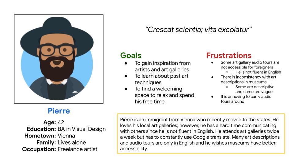
As a freelance artist, I want to go to art museums so that I can learn about art techniques and utilize them in my own work.”
“As a full-time student, I want to discover artists in an organized manner so that I can learn about art history without being overwhelmed.”
Ideation
I first determined the information architecture to inform the user flow. From there, I began to brainstorm how to structure content on each screen to start making wireframes. For each screen, I created five (5) different versions, selected specific elements I liked, and consolidated them.
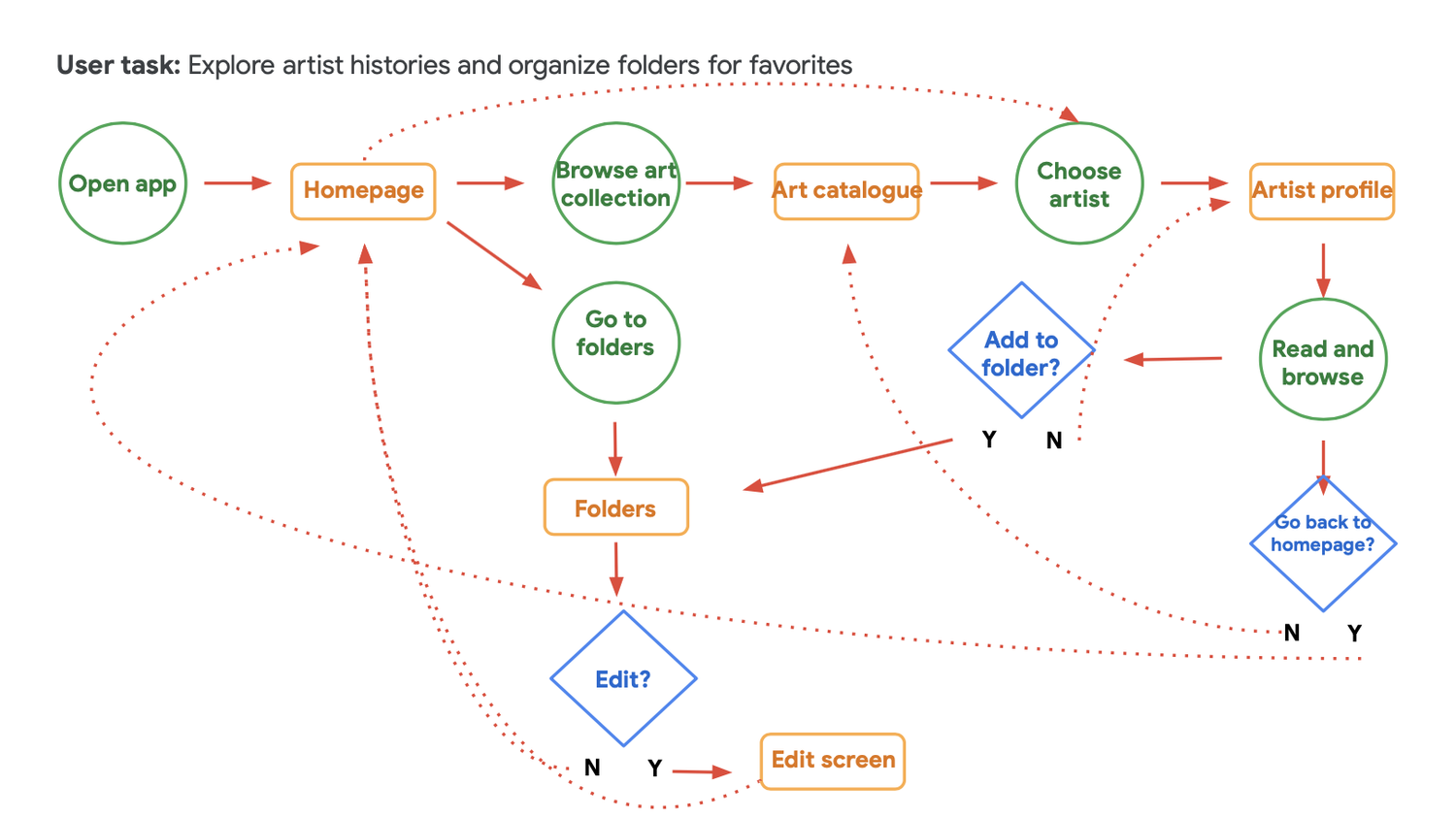
Main user flow
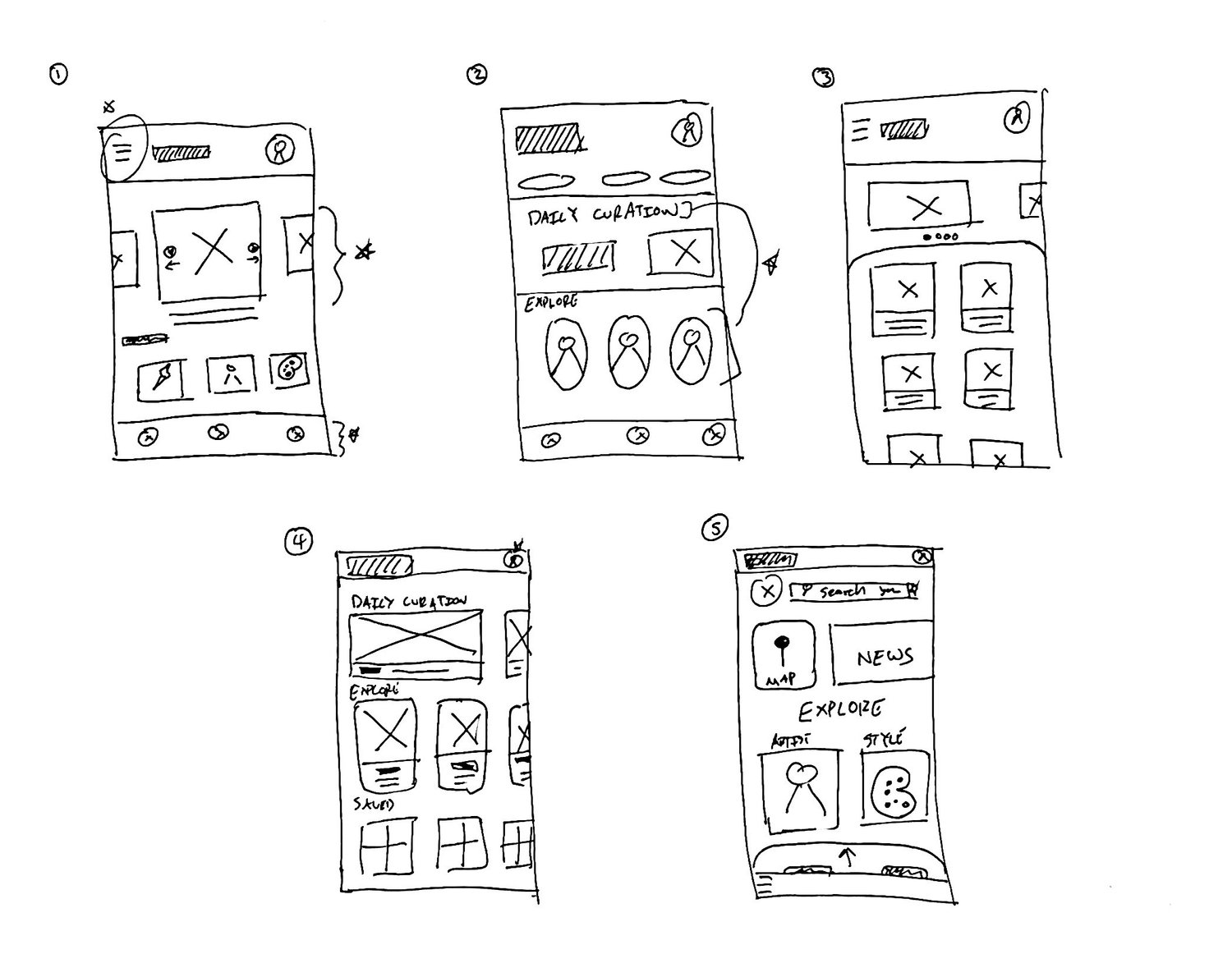
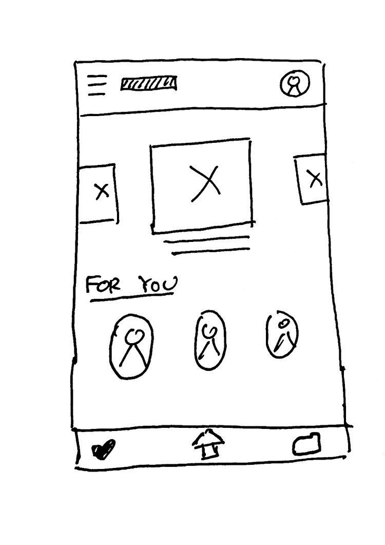
5 ideas for home screen
Consolidated main home screen wireframe
I then created digital wireframes. After I finished the digital wireframes, I created an interactive, low-fidelity prototype. I gave it to five potential users, received feedback, and collected insights to reiterate upon.
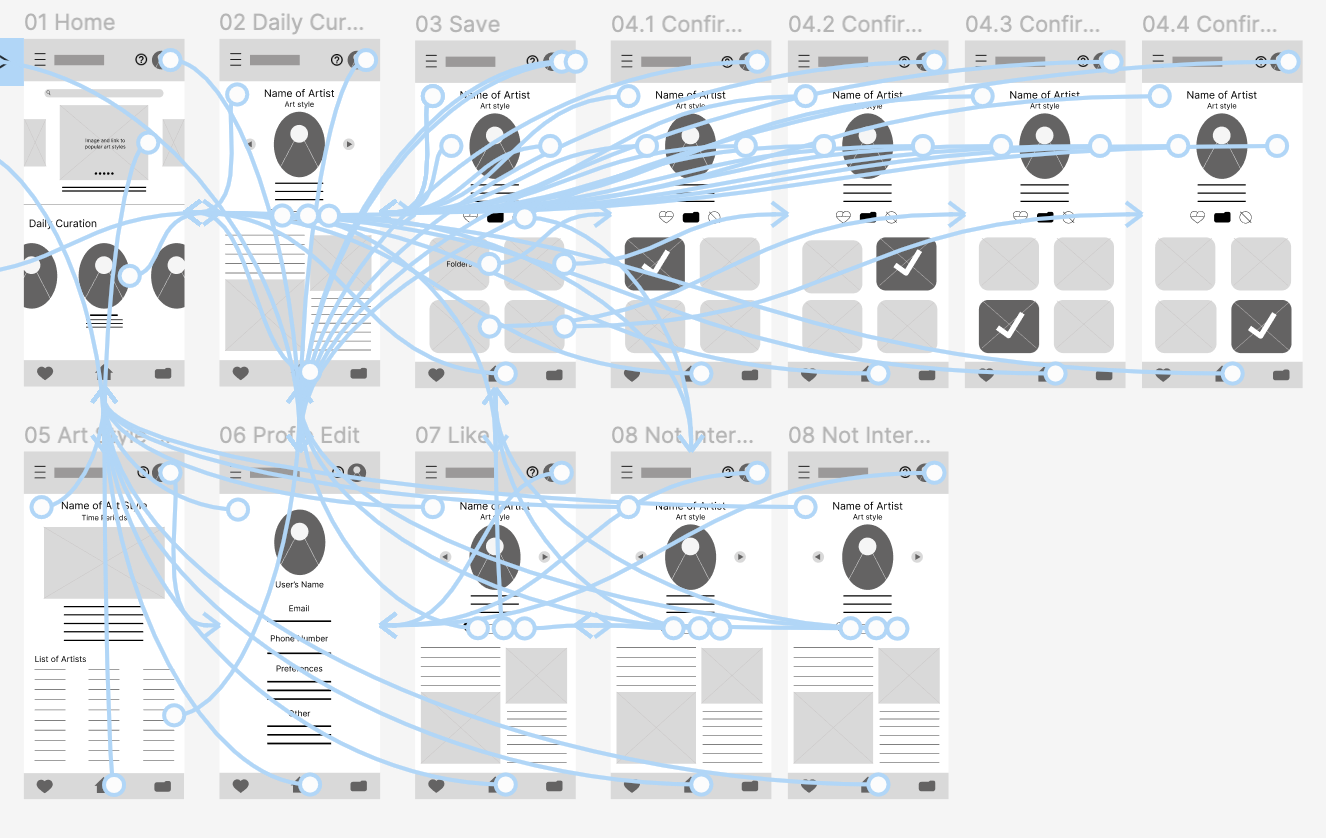
Low-fidelity prototype
User Research
I conducted both a research and usability study to gain insights and understand pain points. Using Miro, I then made an affinity map to highlight key points and visually organize them.
Users wanted:
Users wanted:
- Clearer labels
- More gestures
- Expansive features for folders
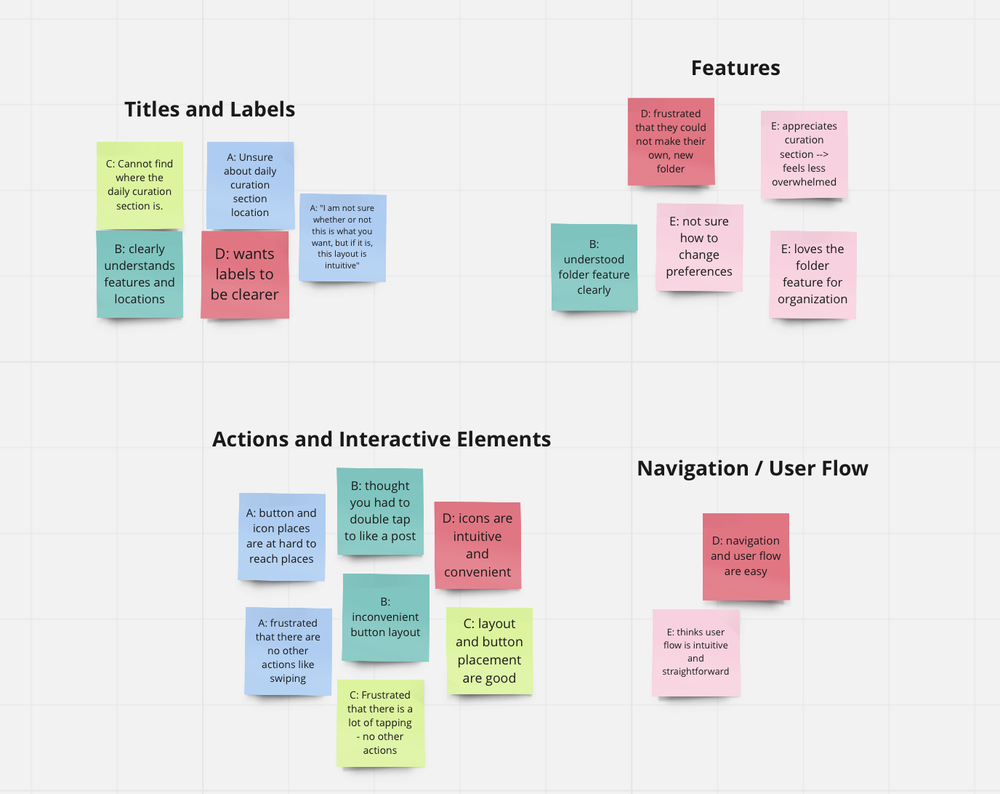
Affinity Map Diagram